(c) Brooke Moorhead Design
I’m very excited to share with you the official “unveiling” of the photos of this Greenwich, Connecticut project we completed early last year. The outcome was unlike any project I’ve done in the past, and it was inspiring to have a result as expressive as this one.
My client has a wonderful whimsy about her, and she is fearless when it comes to taking risks with art and design. Despite the blessing of having unique existing pieces to work with and a homeowner who was very “game”, integrating such art and antiques into a scheme that ultimately looks unified can also prove challenging.
To tackle this challenge, we sought to create a harmonious space by both editing AND adding – refurbishing old pieces and mixing in new ones. This resulted in a bold, colorful, and streamlined reinvention of the interior.
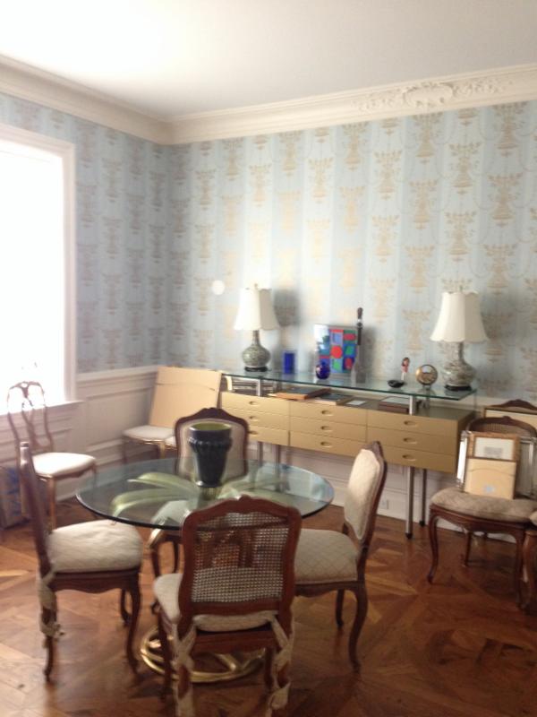
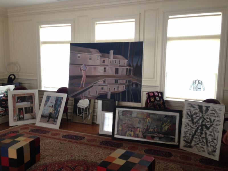
Dining Room BEFORE 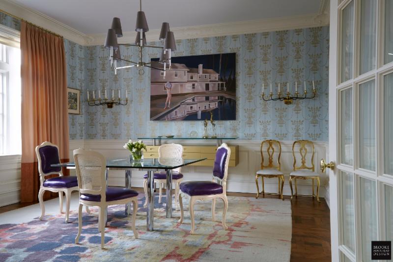
Dining Room AFTER: we revitalized existing pieces and dialed up the drama with additional color and few carefully selected new elements. Photo: Jon Heil
(c) Brooke Moorhead Design
Finding Treasure in Unexpected Places
You never know what can look amazing in a new space, and you might be surprised about how a slight refurbish can bring certain pieces alive. We used the client’s existing and slightly mismatched chairs in several parts of the house. Above, for the dining room, we chose from an assortment of slightly different chairs and then lacquered and upholstered them in a contemporary color scheme (purple leather!), which gave these aging items an exciting face lift. The gold vintage chairs were then used as an accent to add luminescence. Hanging the art strategically on the walls and adding yet another color to the room in the drapery added additional detail and depth.
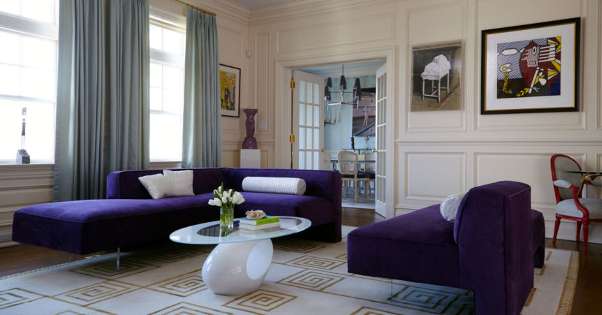
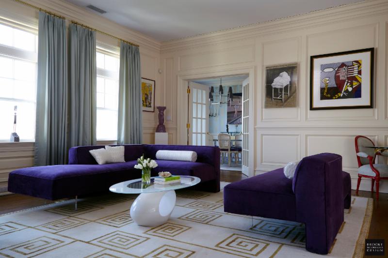
Living Room BEFORE 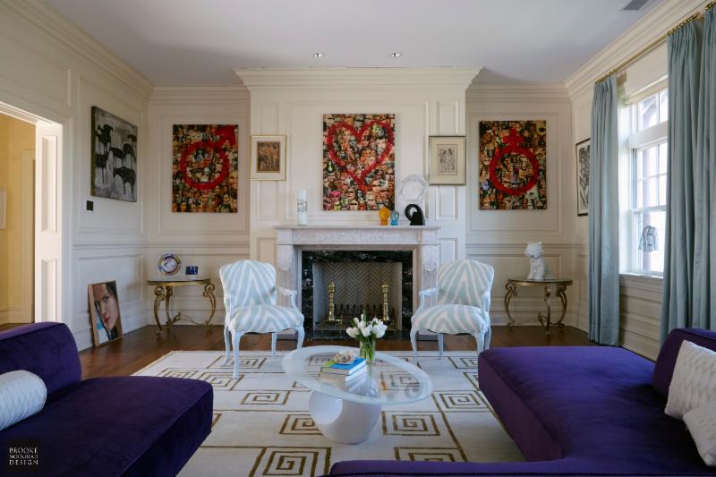
Living Room AFTER: Integrating bold art and patterns. Photo: Jon Heil
(c) Brooke Moorhead Design
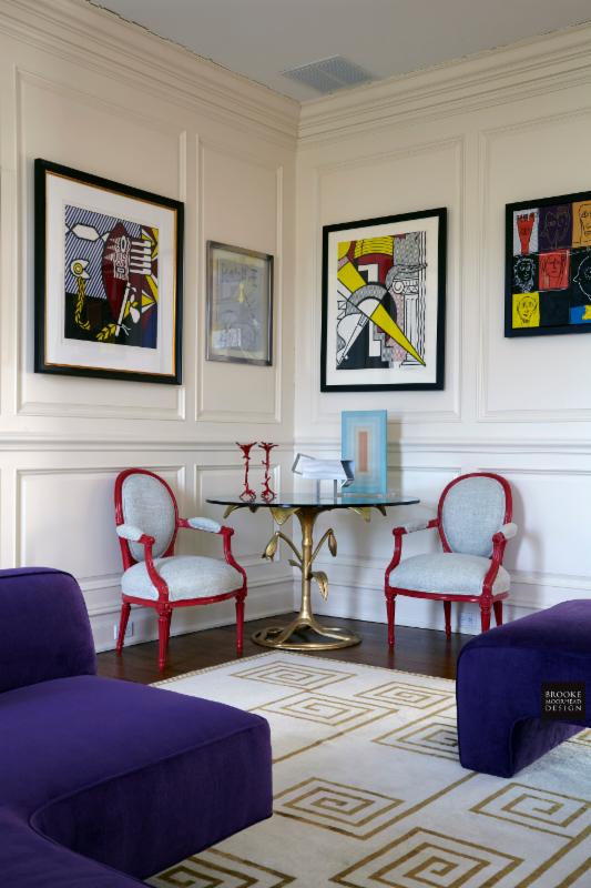
Love Them Equally
The fact is, if you love something, it can have a great impact on your space, no matter what the value. We hung the art in this project based solely on how we thought it would fit into the interior design. The client had some important works, but they were not necessarily placed in the most prominent areas. Because of the extensive collection, we hung art wherever we could fit it. However, by carefully curating placement, we kept the overall look dramatic but not overpowering.
(c) Brooke Moorhead Design
Getting the Best “Bang for your Buck”
We invested in new items where it mattered. In the dining room, we covered the floor with a custom-designed rug, which brought the room to a new level of chroma and gave it an expressive, unique identity. In the living room, the clean lines of the vintage sofa and airy white glass cocktail table keep the look uncluttered amidst the high energy art. We also introduced luxurious satin curtains, which cover a large surface area and create a unifying color to flow from living room to dining room. Adding contemporary, clean elements against the vintage pieces and artwork made the existing items seem all that more appealing in their new incarnations.
(c) Brooke Moorhead Design
In good design,
Brooke